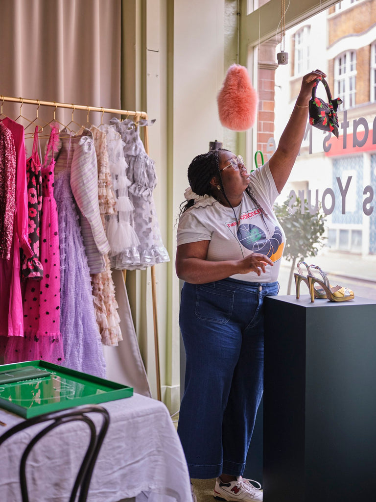
Marylebone By Rotation Holiday Pop Up

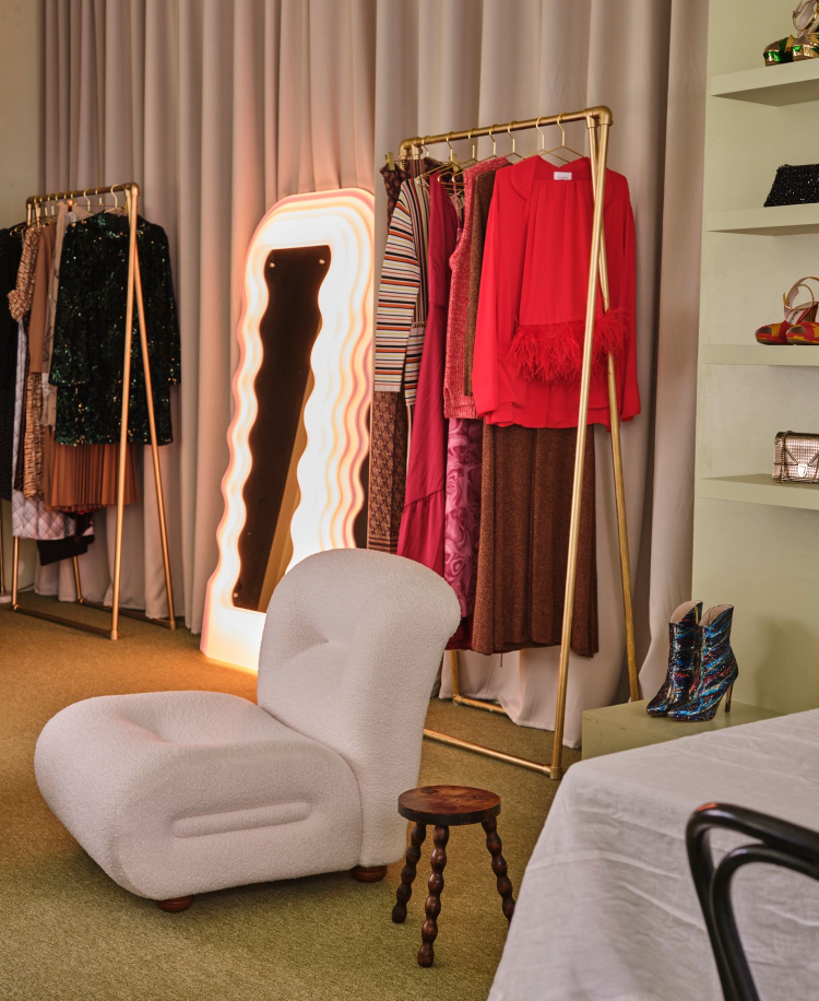
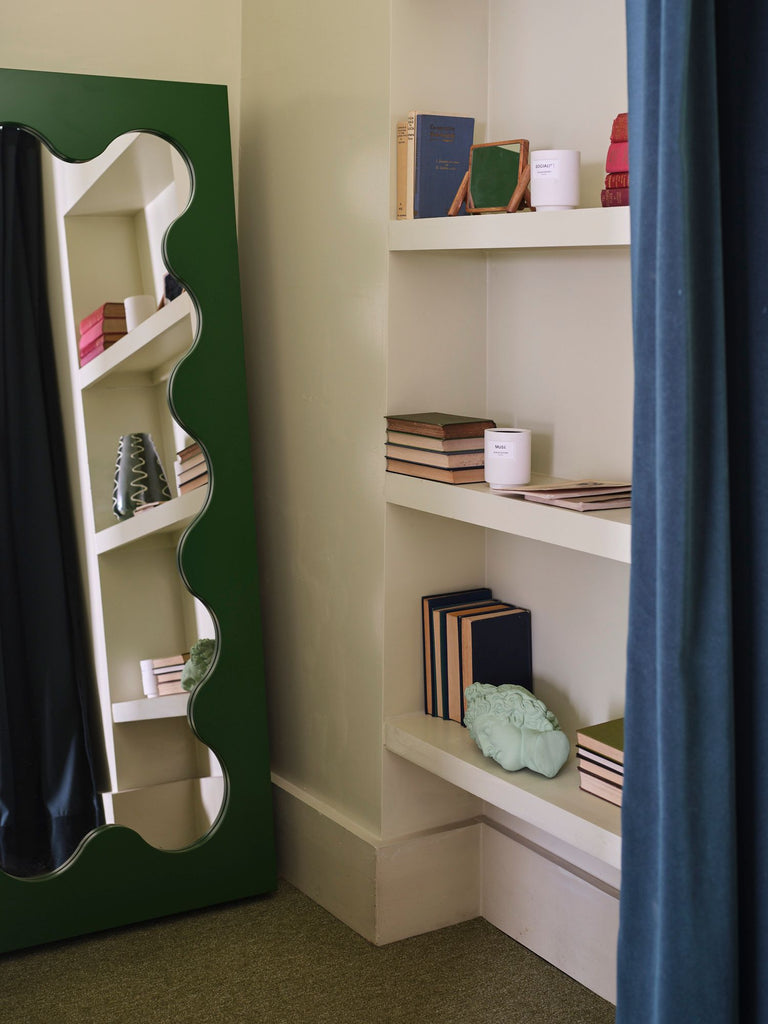
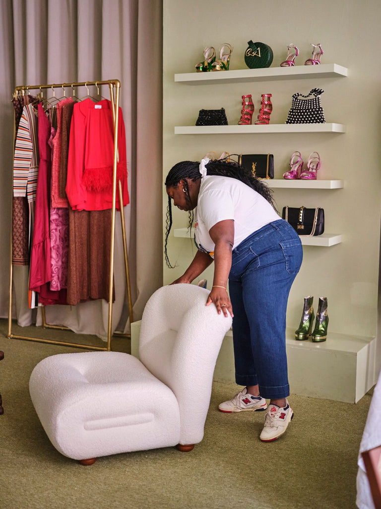
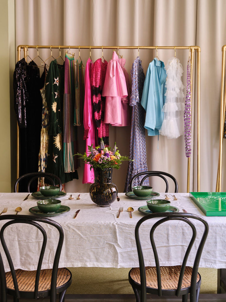
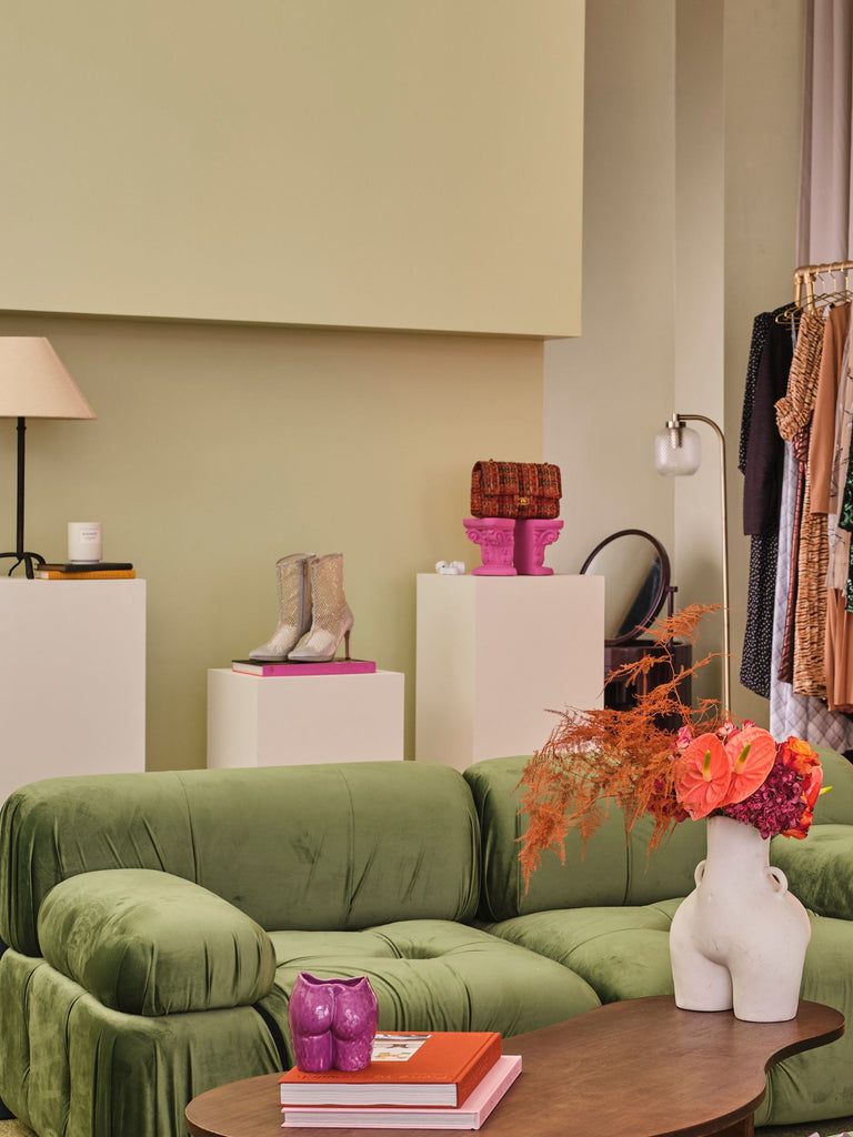
When approaching the design of the store, I wanted to create a space that felt like the ultimate canvas to the clothes. I explored a different kind of neutral that played to By Rotation's official brand colours, ensuring deep green, ivory white & gold were at the heart of the space, as I knew the pieces on the app would be colourful and bold.

From the rails that are made from reclaimed galvanised steel that we painted gold, to the boucle covered armchair that we sourced from an Italian vintage market & reupholstered; the space feels new but holds so much history and has sustainability at the heart of it’s design.

Within the range of decorative items, you’ll find that there are classic and modern art & interior books. I wanted people to find inspiration from the past and present, which somewhat mirrors the overall essence of the space, as it has a very modern feel to it but in actuality features a lot of pieces from the 1950s -70s. The space is filled with structural pieces; even the mundane items like side and coffee tables, have interesting shapes, ensuring that they are great talking pieces but also incredible bases to the fashion forward pieces that they will display.